Pandas Read CSV and animate the data
Introduction
Use Python and Pandas.
Read CSV data, filter, interpolate and smooth it, and the animate the plotting. The file is File:Convergence dataOnly.csv.
| Size | 10 | 15 | 20 | 40 | 50 | 100 | 500 | 1000 | 1500 | 3000 | 3000 | ||
| Nodes | n | 560842 | 240807 | 172644 | 110324 | 103903 | 101052 | 100919 | 138706 | 100919 | 77741 | 69092 | |
| Triangles | n | 140118 | 70994 | 48044 | 28684 | 26868 | 26024 | 25948 | 29970 | 25948 | 23230 | 22232 | |
| Tetrahedrons | n | 313370 | 126061 | 92463 | 60451 | 57002 | 55513 | 55480 | 80746 | 55480 | 40067 | 34291 | |
| Displacement magnitude | max | mm | 0 | 0 | 0 | 0 | 0 | 0 | 0 | 0 | 0 | 0 | 0 |
| Displacement magnitude | min | mm | 0.2 | 0.2 | 0.2 | 0.2 | 0.2 | 0.2 | 0.2 | 0.2 | 0.2 | 0.2 | 0.2 |
| Displacement X | max | um | -31.59 | -31.59 | -31.59 | -31.59 | -31.56 | -31.46 | -31.47 | -31.32 | -31.47 | -31.33 | -30.91 |
| Displacement X | min | um | 1.45 | 1.45 | 1.45 | 1.45 | 1.44 | 1.43 | 1.42 | 1.46 | 1.42 | 1.37 | 1.28 |
| Displacement Y | max | um | -12.69 | -12.69 | -12.69 | -12.69 | -12.68 | -12.67 | -12.67 | -12.69 | -12.67 | -12.64 | -12.57 |
| Displacement Y | min | um | 16.03 | 16.03 | 16.03 | 16.03 | 16.03 | 16.01 | 16 | 15.98 | 16 | 16.01 | 16.1 |
| Displacement Z | max | mm | -0.2 | -0.2 | -0.2 | -0.2 | -0.2 | -0.2 | -0.2 | -0.2 | -0.2 | -0.2 | -0.2 |
| Displacement Z | min | um | 1.8 | 1.8 | 1.8 | 1.8 | 1.8 | 1.81 | 1.81 | 1.81 | 1.81 | 1.77 | 1.71 |
| von Mises Stress | max | kPa | 0 | 0 | 0 | 0 | 0 | 0 | 0 | 0 | 0 | 0 | 0 |
| von Mises Stress | min | kPa | 1281.81 | 1281.81 | 1281.81 | 1281.81 | 1297.14 | 1311.81 | 1286.65 | 1250 | 1286.65 | 1273.95 | 1282.35 |
| Max Principal Stress | max | kPa | -176.22 | -176.22 | -176.22 | -176.22 | -172.74 | -172.69 | -171.95 | -184.54 | -171.95 | -169.48 | -180.97 |
| Max Principal Stress | min | kPa | 967.43 | 967.43 | 967.43 | 967.43 | 1014.52 | 955.45 | 1085.01 | 1140.49 | 1085.01 | 798.06 | 754.78 |
| Min Principal Stress | max | kPa | -1345.87 | -1345.87 | -1345.87 | -1345.87 | -1358.44 | -1343.18 | -1306.44 | -1295.94 | -1306.44 | -1325.73 | -1359.73 |
| Min Principal Stress | min | kPa | 109.99 | 109.99 | 109.99 | 109.99 | 108.23 | 114.84 | 115.2 | 126.83 | 115.2 | 106.69 | 119.98 |
| Max Shear Stress | max | kPa | 0 | 0 | 0 | 0 | 0 | 0 | 0 | 0 | 0 | 0 | 0 |
| Max Shear Stress | min | kPa | 648.93 | 648.93 | 648.93 | 648.93 | 658.46 | 663.91 | 654.4 | 628.53 | 654.4 | 647.25 | 647.95 |
Read and Interpolate
-
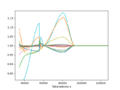
Interpolated data
-
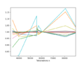
Original, non-interpolated data


import matplotlib.pyplot as plt
import pandas  as pd
import numpy as np

#Read, transpose, sort, drop and set the index to be the number of tetrahedrons
#and drop the columns with zero values and some parameters
df = pd.read_csv("convergence_dataOnly.csv" ).T
df.columns = ( df.iloc[0] + " " + df.iloc[1] )
df = df[3:].sort_values("Tetrahedrons n")
df.set_index("Tetrahedrons n", inplace=True)
df = df.drop('Displacement magnitude max', axis=1)
df = df.drop('von Mises Stress max', axis=1)
df = df.drop('Max Shear Stress max', axis=1)
df = df.drop('Nodes n', axis=1)
df = df.drop('Triangles n', axis=1)

#Convert values and index to numeric
df= df.apply(pd.to_numeric)
df.index = pd.to_numeric( df.index, errors='coerce' )

# Interpolate # Need to drop the one with the same number of tetrahedrons
mask = np.ones( len(df), dtype=bool)
mask[2] = False
df = df[mask]

#Get the percentage
df = df.divide( df.iloc[9] )
print(df)

df_i = df.reindex(df.index.union(np.linspace(df.index.min(),df.index.max(), df.index.shape[0]*10)))  # insert 10 NaN points between existing ones
df_i = df_i.interpolate('pchip', order=2)  # fill the gaps with values
df_i.plot( legend=False)  # draw new Dataframe
Animate the data
Images to GIF
Reverse the layers: From the main menu through Layers → Stack → Reverse Layer Order.
Animate 1 line updating

This tutorial was found on https://docs.kanaries.net/topics/Matplotlib/matplotlib-animation.
from matplotlib.animation import FuncAnimation

x = df_i.index.to_numpy()
y = df_i["Max Shear Stress min"].to_numpy()
xdata, ydata = [], []

fig, ax = plt.subplots()
fig.set_size_inches( 10/2.54, 20/2.54  )
ax.set(xlim=(0, max(x)), ylim=(.8, 1.2))
line = ax.plot( [], [], color='r', lw=2)[0]

def animate(i):
    xdata.append( x[i] )
    ydata.append( y[i] )
    line.set_data( xdata, ydata )
    plt.savefig("image{i}.png".format(i=i), dpi=300 )
    return line

anim = FuncAnimation(fig, animate, frames=x.size, interval=100, repeat=False)
plt.show()
Animate N lines updating

Animation is easy, once you find the correct tutorial.
from matplotlib.animation import FuncAnimation

x = df_i.index.to_numpy()
y = df_i.to_numpy()

fig, ax = plt.subplots()
ax.set(xlim=(0, max(x)), ylim=(.7, 1.3))
lines = ax.plot(np.empty((0, y.shape[1])), np.empty((0, y.shape[1])), lw=2)

def animate(i):
    for line_k, y_k in zip(lines, y.T):
        line_k.set_data(x[:i], y_k[:i])
    plt.savefig("image{i}.png".format(i=1), dpi=50 )
    return lines

anim = FuncAnimation(fig, animate, frames=x.size, interval=100, repeat=False)
plt.show()
Animate x + t dimensional
Brushing Up Science demonstrates many beautiful animation procedures. This is one (https://brushingupscience.com/2016/06/21/matplotlib-animations-the-easy-way/):
fig, ax = plt.subplots(figsize=(5, 3))
ax.set(xlim=(-3, 3), ylim=(-1, 1))

x = np.linspace(-3, 3, 91)
t = np.linspace(1, 25, 30)
X2, T2 = np.meshgrid(x, t)

sinT2 = np.sin(2*np.pi*T2/T2.max())
F = 0.9*sinT2*np.sinc(X2*(1 + sinT2))

line = ax.plot(x, F[0, :], color='k', lw=2)[0]

def animate(i):
    line.set_ydata(F[i, :])

anim = FuncAnimation( fig, animate, interval=100, frames=len(t)-1 )

plt.draw()
plt.show()
Animate 2
Add the new points in the update function. The clear command clears everything, so this in not very neat.
from random import randint

import matplotlib.pyplot as plt
from matplotlib.animation import FuncAnimation

# create empty lists for the x and y data
x = []
y = []

# create the figure and axes objects
fig, ax = plt.subplots()


def animate(i):
    pt = randint(1,9) # grab a random integer to be the next y-value in the animation
    x.append(i)
    y.append(pt)
    ax.clear()
    ax.set_xlim([0,20])
    ax.set_ylim([0,10])
    ax.plot(x,y)

# run the animation
ani = FuncAnimation(fig, animate, frames=20, interval=100, repeat=False)

plt.show()
Animate 3
Animate Bar Graphs
Try easings functions to get a nice bounce or elastic effect; https://gist.github.com/robweychert/7efa6a5f762207245646b16f29dd6671 ; https://easings.net/ https://robertpenner.com/easing/ or pypi Easings (https://pypi.org/project/easing-functions/).
Use virtual engine
The virtual engine is used because of the easing functions. However, it requires installing the other packages too.
python -m venv .
source bin/activate
pip install easing-functions
pip install numpy
pip install pandas
pip install matplotlib
Read the data and set variables
Import the packages. The data is csv ( File:FEM results.csv, from [1]), but a slightly modified (the two top rows are combined compared to the original at FEM and Blender page). The index is set, and title depicts which column is used.
the names depict which columns are to be plotted. Equally, the idxs variable contains the corresponding indexes. Setting those could be automated, but I didn't do that.
from matplotlib import pyplot as plt
from matplotlib import animation
from easing_functions import *
import numpy as np
import pandas  as pd

fig, ax = plt.subplots()

df = pd.read_csv("FEM_results.csv" )
df.set_index( df["Design"], inplace=True  )
df.drop( ["Design"], axis=1, inplace=True )
title = "Max Shear Stress Max [kPa]"
dmax = df[title]

colors = ['#442b48', '#726e60', '#98b06f', '#b6dc76', '#dbff67']
idxs = [5, 6, 7, 8, 9]
names = ['No Rafters\n + Roof', '22.5° rafter \n+ Roof', '22.5° × 2 \nrafters + Roof', '45° rafter\n short + Roof', '45° rafter \nlong + Roof']

Dps = 100
Make the bouncing scheme
The X matrix (array) will contain the animation steps for all idxs. The easing functions are designed such that the input of the functions is , and thus x is a variable containing the corresponding floating point numbers. The easing functions input the beginning and the end position of the y values. The duration is set to one, 1.
![{\displaystyle [0,1]}](https://wikimedia.org/api/rest_v1/media/math/render/svg/738f7d23bb2d9642bab520020873cccbef49768d)
X = np.zeros( (len(names), Dps)  )
x = np.linspace(0, 1, Dps)
for i,j in enumerate(idxs):
    a = BounceEaseOut(start=0, end=float(dmax.iloc[j]), duration=1)
    X[i] = list( map( a,x ) )
The float is needed because of the wrong format. It can be fixed when reading the dataframe from csv, eg using
#Convert values and index to numeric
df= df.apply(pd.to_numeric)
df.index = pd.to_numeric( df.index, errors='coerce' )
but I didn't try this now.
Animate the data
The animation is simple and follows directly the manual given at https://matplotlib.org/stable/users/explain/animations/animations.html. We use the artist which will contain all the animation data at all timesteps. Thus, we will have a precomputed list of images.
artists = []
for i in range( Dps ):
    container = ax.bar( names, X[:,i], color=colors )
    artists.append( container )

ani = animation.ArtistAnimation(fig=fig, artists=artists, interval=10, repeat=False)
plt.title( title )
plt.show()
Save the animation
The animation can be saved. GIF (and mp4) format is easy:
f = (title+".gif").replace(" ", "")
writergif = animation.PillowWriter(fps=30)
ani.save(f, writer=writergif)
but png is giving some troubles. Thus, save it in gif and convert using Imagemagick's converto to pngs
magick image.gif -coalesce image.png
Images
